Rebranding a growing UX agency
My first project at Blink UX: the voice, messaging, and brand guidelines for a full rebrand of the agency.
Role: Content strategy lead and copywriter
Launched: October 2019, with a new website
Client: Blink UX (in-house)
Challenge
Blink was a UX research firm known for evidence-driven design. Around the time I joined, it acquired Tectonic, a Seattle studio focused on brand expression and visual design, and later Redshift, another studio with a more expressive style.
The visual identity no longer matched where the company was going. If you're pitching clients on brand expression, you need an expressive brand. The rebrand had to keep Blink's commitment to evidence while showing it as fun, cool, and thoughtfully designed.

Process
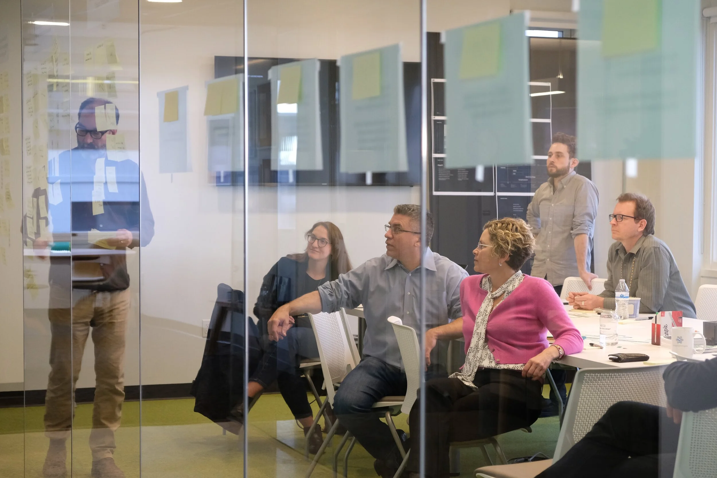
I used the last day of paid time off at my previous job to join a brand workshop at Blink, where the project team met with leadership for the first time to shape a vision for the rebrand. My main stakeholder was Bill Flora, founder of Tectonic, alongside Blink's co-founders, CEO Karen Clark Cole and Chief Innovation Officer Kelly Franznick.
From there, I pulled together insights from stakeholder interviews, interviews with Blink clients, and later, user research on design comps. That became a new messaging architecture, all-new website content, and the brand guide.


What’s in the brand guide
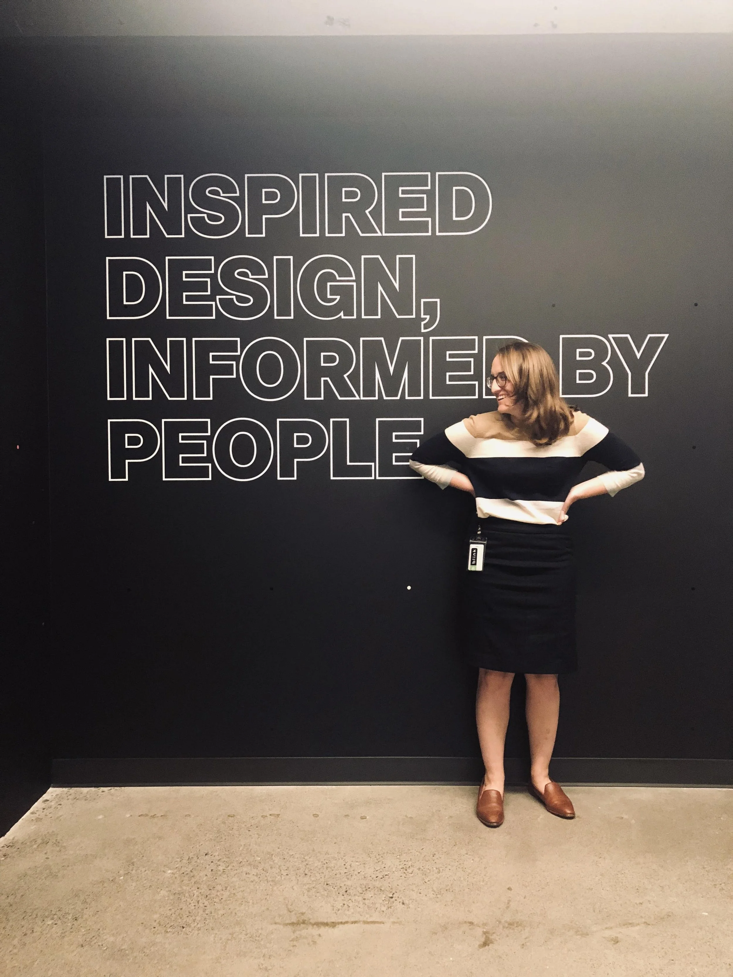
Tagline: Inspired design, informed by people.
Principles: scientific, imaginative, sincere.
Voice: a knowledgeable, friendly person having a conversation. Plain-spoken when possible, technical only when it helps.
Tone, as tradeoffs: approachable over technical, jokes over jargon, brief over meticulous, outcomes over process, collaborative over boastful.
Word choices: rules of thumb (use one precise adjective instead of two redundant ones; if you can say 80 percent of the idea in 20 percent of the words, stop) and a list of words to leave behind, from "best-in-class" to "synergy."
Small decisions that add up: Blink has studios, not offices. "Blink UX" for audiences who don't know us yet, "Blink" for those who do. Airport codes when space is tight.
The visual system was designed by Alice Wicks of Form with the Blink team. I wrote the guide's messaging sections and its copy throughout.
Outcome
Blink launched the new website and brand guide in October 2019. Through 2021, I was the primary authority on applying the guide and kept it evolving as the company grew. In 2020, I helped shape the core messaging for a Blink culture video, gave feedback on the edit, and appeared as its first talking head.
The voice has lasted. Much of the website copy I wrote is still live, and the tagline is still on the wall by the elevators in Blink's studio.